The Problem With Too Much Info
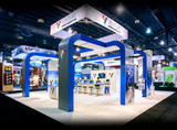
We’ve all heard once or twice in our lives… Keep It Simple Stupid(KISS)! This simple concept is, at times, not as simple as it sounds. As a business owner, we understand the need to get as much info out there about your new product or service as possible. While this seems logical, it isn’t necessarily the best way to attract traffic when exhibiting at a trade show. We know… you want others to get to know your company. What you don’t want to do is give away everything about your company on your pop-up display. The illustration below is a great example of why less is better.
The problem with too much info is that trade show attendees will not be curious enough to come any closer, why should they? You’ve already given them all they need to know. Chances are, they will just visit the next booth. This translates to ZERO RETURN ON INVESTMENT. You spent thousands of dollars on display hardware, graphics, collateral handouts and travel, but got minimal return for your efforts.
Presentation is everything. We recommend the Gold Fish Standard of design. This design principle, like the KISS principle, employs simplicity by taking into consideration the human brain’s ability to process cohesive information, as well as the attention span of trade show attendees.
The rule of 3 is the backbone to the Gold Fish Standard principle of design.
- 3 seconds is all you have to capture the audience’s attention
- a maximum of 3 colors should be used for your scheme
- 3 most important elements – Logo, Tagline, and Supporting Graphic
Keep these 2 principles in mind when creating your next trade show graphics and you’ll definitely see a return on investment the next time you exhibit.
The post The Problem With Too Much Info appeared first on Exponet USA.
Recent Posts
-
Top 10 Best Trade Show Displays of 2024
A well-designed trade show display can leave a lasting impact on showgoers. Here are some of the bes …Feb 7th 2024 -
7 REASONS FOR STANDING DISPLAY ADVERTISING
The world has evolved over the past few years and so have the means of advertisements. Historically, …May 9th 2022 -
Why Should You Buy Custom-printed Table Throws?
Whether you're preparing for a charity event, a trade fair, or any promotional event, you want to …Mar 28th 2022


